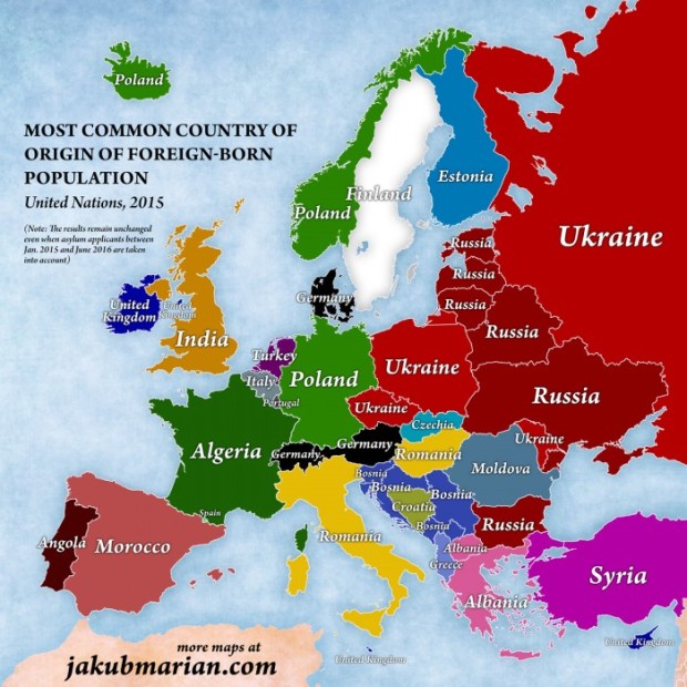
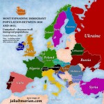
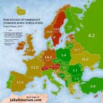
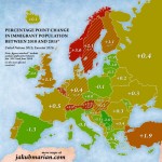
The Spanish magazine Contexto, CTXT (in this article, published by Jakob Mariam and Max Galka), presents the maps developed by the Czech mathematician and linguist Jakub Mariam, who, by relying in the European data on asylum and immigration from 2010-2016, focuses on tearing down the prejudices on the scale of the “refugee crisis” and its alleged impact in Europe.
Mariam manages to tear down some of the racist myths used by some conservative governments and far right movements in Europe.
By cross-matching the data from the UN report of 2015 with the asylum applications published by Eurostat between January 2015 and June 2016, Mariam manages to tear down some of the racist myths used by some conservative governments and far right movements in Europe. The numbers marked by an asterisk update the UN’s data with the asylum applications accepted by the European countries during the last wave of immigration. Mariam only highlights the countries affected by the so-called “refugee crisis” in more than a 0.4%.
Inmigration, on video
At the end of the article, we reproduce the video produced by data visualization expert Max Galka, which shows the net flows of migration (differences between the outflows and inflows of migrants of a country) in the world. The visualization corresponds to the movements of population between 2010 and 2015. The countries with a positive net flow are marked in blue, while the countries with a negative net flow are red.
Most of this period’s population movements –both inflows and outflows– are concentrated in the Middle East and India. South America is the region with the less activity; Africa has an important internal movement; and the regions concentrating the biggest negative net flows are Southeast Asia, Central America, and Europe. Galkan relies on the dat published by the UN’s Population Division.
Source: Ctxt
Translation: Alfonso Casani






No Comments