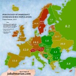
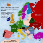
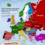
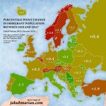
Are the arguments on immigration and the refugee crisis used by far-right and conservative movements true? Through the following maps and videos, which quantify the numbers of immigrants and refugees and the immigration flows worldwide, the mathematician and linguist Jakub Mariam and the expert on data visualization Max Galka prove they are not.
This video, produced by the specialist on data visualization Max Galka, shows the world’s net migration flow (the difference between each countries’ departures and entries). The visualization corresponds to the population movements between 2010 and 2015. The countries with a positive net flow are painted blue, those with a negative net flow appear in red.
Most of this period’s population movements –entries and departures– belong to the Middle East and India. South America is the region with the least activity. Africa has important migration routes (all internal), and the countries with the highest negative net migration flows belong to Southeast Asia, Central America, and Europe. Galkan has obtained the data from the UN population department.
On the other hand, the Czech mathematician and linguist Jakub Mariam has designed four maps that summarize the asylum and immigration data in Europe between 2010 and 2015. By crossing the data of the UN’s report published in 2015 with the numbers of asylum requests gathered by Eurostat from January 2015 to June 2016, Mariam dismantles the myths reproduced by far-right and conservative movements all across Europe. The numbers appearing in the maps with an asterisk update the UN’s data with the asylum requests accepted during the last immigration wave. Mariam only highlights those countries whose numbers reach at least a 0.4%.
Source: CTXT


No Comments